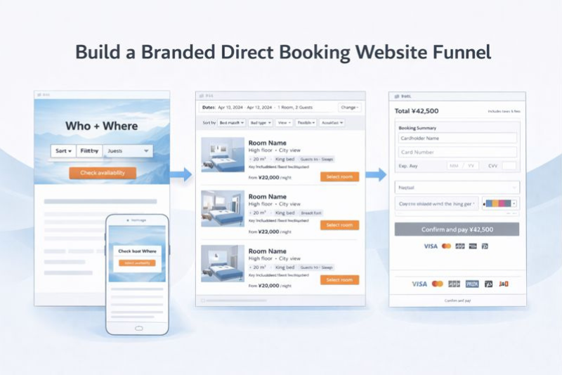
Build a Branded Direct Booking Website That Converts Visitors Into Bookings
You don’t need a “better website.” You need a branded direct booking website that converts.
Most hotel sites underperform. Their pages don’t focus on one visitor action. They mix inspiration, room details, and checkout logic everywhere. Guests hesitate, compare prices, and end up booking elsewhere — because it’s not easy.
You need a better framework that converts.
We use the following design principles for our clients to improve direct conversions:
- Landing page → Availability check
- Availability/listing → Room match
- Checkout → Payment
But before you touch design, you must understand your guests. Not by guessing, but by talking to real guests and the staff who speak to them every day.
Each stage of your site is designed to answer your ideal guest’s questions in the order they ask them, with one clear next click.
Key takeaways
- Your direct booking site is a 3-stage sales funnel: Availability check → Room match → Payment. Build each stage to do one job.
- Start by documenting your ideal guest by talking to guests + front desk. That becomes the build brief.
- Stage 1 wins when the first screen creates fit + trust fast and makes Check availability the obvious next click.
- Stage 2 wins when room cards make differences scannable and help guests choose without confusion.
- Stage 3 wins when checkout removes surprises and work so guests can pay confidently.
- Build, and iterate by tracking conversion metrics at each stage
This is not build-and-done. It’s build-and-improve.
You are not trying to guess the perfect website in one go. You are building a funnel, then tightening it based on what guests do.
Build it first. Launch it clean. Improve what leaks.
As you build each stage, you must know:
- What action you want the guest to take next,
- What you’ll measure to confirm it’s happening,
- What you’ll change if it’s not.
Launch a clean version and improve the parts that leak. Don’t expect perfection.
Step zero: Understand your guest (by talking to people)
This framework only works if the site is built for the guests you actually host.
If you don’t define that guest, you end up with a generic website that tries to appeal to everyone and converts no one.
The goal here is simple: write down what your best guests care about, what they worry about, and what they need to see to move forward. You already have this information inside the hotel. You just need to document it.
What you’re producing
One page per guest profile. That’s it.
For your top 2–3 guest types, document:
- Trip purpose: why they come
- Decision drivers: what they optimize for (sleep, location, space, flexibility, value)
- Booking blockers: what causes hesitation (noise, parking, cancellation, fees, room confusion)
- Room drivers: what makes them choose one room over another
This becomes your filter. If a section of the website doesn’t help one of these guest types take the next step, it’s not helping conversion.
How to get the inputs (keep it simple)
Talk to five recent guests. Ask:
- Why did you pick us?
- What did you need to know before you checked dates?
- What almost stopped you?
- What should have been clearer on the site?
Talk to the front desk staff. Ask:
- What questions do people ask before they arrive?
- What confuses people about rooms?
- What surprises people at payment or on arrival?
Scan recent reviews for repeated phrases. Capture the language guests actually use.
You’re not doing research for research’s sake. You’re pulling out the inputs that tell you what must appear in Stage 1, Stage 2, and Stage 3 of your booking funnel.
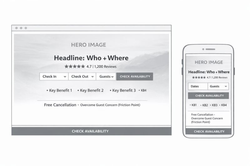
Stage 1: Homepage → Availability check
At this stage, the guest is not choosing a room. The guest is deciding whether it’s worth checking dates on your site.
Your homepage has one job: earn the availability check. You don’t earn it with a booking widget. You earn it by putting what the guest wants in front of them in a way that feels immediately relevant, trustworthy, and easy to act on.
Think of the first screen as a sales pitch with one outcome: dates entered.
What “earning the availability check” actually means
A guest checks availability when three things happen quickly:
- They see themselves in the offer (fit)
- They believe the hotel is real and predictable (trust)
- The next step feels effortless (ease)
The role of visuals and structure is to create a feeling of fit and trust faster than text can.
Visual hierarchy: what the first screen must do
The first screen should work like this:
- One strong image that sells the outcome your target guest wants
- One line that names the fit (who it’s for + where it is)
- One primary action: Check availability
- One proof element: rating + review count
- One confidence line: cancellation + check-in/out (the friction point you always get asked about)
Photography rules
Your hero image should be a decision photo, not a brand photo.
- If you sell sleep: show the bed, light, quiet vibe.
- If you sell location: show the view or a recognizable nearby anchor.
- If you sell space: show layout and seating, not a tight crop.
- If you sell the bath/onsen: show the bath clearly and honestly.
Copy rules (short, specific, tied to the guest)
Write headlines that help the right guest self-qualify.
- “Quiet rooms near ___ for business stays”
- “Walkable base for ___ with spacious rooms”
- “Family-ready rooms with free breakfast”
Landing-page structure (non-negotiables)
- One primary CTA: Check availability
- Booking access above the fold on mobile (widget or one-tap opener)
- Persistent availability access (sticky header / sticky mobile bar)
- Trust signals beside the CTA, not buried below
Stage 1 “done” criteria
- The first screen communicates: fit + proof + next step.
- Dates are reachable in one action from any page.
- The hero visual is a decision photo.
Homepage wireframe
Homepage tracking (simple)
Track two key numbers and split them by channel when diagnosing.
- Site visits
How many sessions hit the homepage. Break it down by channel (organic, paid, social, email, referral) to see which sources are actually feeding the funnel. - Click-through ratio
The percentage of homepage visitors who click “Check availability” (or open the date picker). This is your homepage conversion metric.
Use it like this:
- If visits are up but CTR is flat, you’re buying/earning the wrong traffic, or the first screen isn’t compelling enough.
- If CTR is low, your hero + headline + trust + CTA placement aren’t earning the next click.
- If CTR is strong but bookings are weak, the problem is downstream (room listing or checkout), not the homepage.
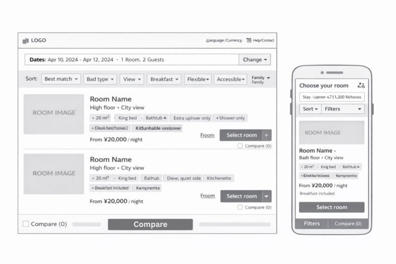
Stage 2: Availability/listing → Room match
At this stage, the guest already has dates. They are not asking, “Is this hotel interesting?” They are asking, “Which option is right for me?”
Your room listing is the e-commerce moment. Your job is to make it easy for the guest to find the right product and feel confident selecting it.
This is where you apply what you learned from your conversations with guests. If your ideal guests care about breakfast, bath/onsen access, pool, view, bed type, or room size, those must be obvious here.
The listing page should reflect your guest profiles. If families are your target, space and bedding options lead. If couples are your target, lead with bath and view. If business travelers are your target, lead with the sleep-and-work setup.
What “earning the room match” actually means
A guest selects a room when three things happen quickly:
- They can find the right category (filtering and scanning)
- They understand the difference between options (comparison)
- They feel confident moving forward (clarity)
This is why the listing page is not a gallery. It’s a decision tool.
Visual hierarchy: how room cards should sell
Each room card should do two things visually:
- show the one photo that represents the room truthfully (not the lobby, not the bar)
- make key differences scannable without reading paragraphs
Room photo rules
Use the lead photo that answers the most common “will this work for me?” question:
- Bed + sleep environment (most common)
- Layout/space if you sell room size or family stays
- Bathroom/bath if tub/onsen matters
- View if view is a real differentiator you charge for
Avoid mood photos in the card itself. Keep the card as a decision point.
What must be on the listing page (so guests can choose)
Every room card should show the same decision facts in the same order. Consistency is what makes comparison easy.
Room decision facts
- Size (sqm)
- Bed type
- Max occupancy (realistic)
- Bath type (shower vs tub)
- View/noise note if it matters
- One differentiator the guest can picture (balcony, corner, kitchenette, etc.)
Rate and selection clarity (match this to your guest)
Some guests shop for flexibility. Some don’t. The rule is simple: put the terms your ideal guest cares about in front of them before they commit. That can be on the card, on the “View rates” step, or in a clean “rate details” reveal — but it cannot be hidden until payment.
Filters and sorting (keep it aligned to real guest intent)
Don’t build filters because you can. Build filters because your guests ask for them.
High-value filters in hotels:
- Bed type
- Bathtub
- View
- Balcony/terrace
- Connecting rooms
- Accessible
- Breakfast included (only if it’s a consistent option)
- Refundable (only if flexibility is a core driver for your guests)
If pool or onsen access is a decisive reason people choose you, don’t hide it as a generic amenity. Make it obvious in the listing with a badge or inclusion note tied to the room/rate where applicable.
Comparison support (so selection doesn’t stall)
Guests stall when they can’t answer “what’s different?” fast. Give them a simple compare option.
A basic compare view should include:
- Size
- Bed
- Occupancy
- Bath type
- View/noise
- Inclusion highlights (breakfast/credit/onsen where relevant)
Copy rules for room cards
Room names should communicate differences in plain language. If your branded room names don’t do that, add a functional sublabel.
- “Deluxe King — High Floor, City View”
- “Family Twin — Extra Space, Sofa Bed”
- “Chic Double — Shower Only”
Don’t make the guest decode “Deluxe Chic vs Grand Deluxe Chic.” That is operator language, not buyer language.
Stage 2 “done” criteria
- A guest can scan and shortlist without clicking 5 different room pages.
- The differences are obvious on the listing, not buried.
- The terms your ideal guest cares about are visible before they commit.
- Filters match your real guest questions and decision drivers.
Listing page wireframe
Listing page tracking
Track volume and the selection rate.
- Listing page visits (by channel/device): how many people reach the room listing after the date search.
- Room card click-through rate (CTR): % of listing visitors who click Select room / View rates on any room card.
- Room selection rate: % of listing visitors who choose a room and move to the next step (rate selection or checkout start).
If CTR is low, your room cards aren’t surfacing the right decision info (photo choice, key features, what matters to your guest, price clarity).
If CTR is strong but the selection rate is low, the issue is usually confusion at the rate selection step or too many options.
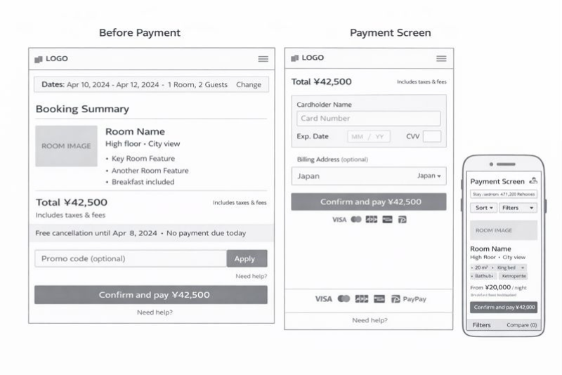
Stage 3: Checkout → Payment
At this stage, the guest has chosen. Now they’re deciding whether they trust you enough to pay.
Your checkout needs to do two things: remove doubt and remove work. The guest should not be thinking here. They should be confirming.
What “earning payment” actually means
A guest pays when three things are true:
- The total feels final (no surprises)
- The rules feel clear (cancellation and charges)
- The process feels safe and simple (especially on mobile)
Anything that increases uncertainty or effort reduces conversion.
Trust signals that matter at payment
Trust at checkout is not decoration. It’s clarity and competence.
What should be obvious near payment:
- Total in the guest’s expected currency (consistent throughout)
- Taxes/fees included or clearly explained before the final step
- Cancellation summary in plain language
- Deposit/prepay summary in plain language
- Accepted payment methods and when the card is charged
- Clear contact path if something goes wrong (not hidden)
If your guests routinely ask “when am I charged?” or “can I cancel?” those answers must be visible here without hunting.
Reduce friction (owner-controlled)
- No account creation
- Minimal fields (only what you need)
- No unnecessary upsells before confirmation.
- Clear, human error messages (what to fix and why)
- Mobile-first layout (one thumb, readable, fast)
Keep continuity (so the guest doesn’t feel they left your site)
If the booking engine looks and behaves like a different website, some guests will stop. Visual continuity is a trust signal. The guest should feel like they are still booking with you, not being redirected to a third party.
Stage 3 “done” criteria
- The total cost is clear before the final click.
- Cancellation and charges are understandable at a glance.
- Checkout is short and smooth on mobile.
- The payment step feels secure and predictable.
Checkout wireframe
Checkout tracking
Stage 3 has one job: turn checkout starts into paid bookings. Track starts, completion, and where people drop.
- Checkout starts: how many sessions enter checkout from Stage 2.
- Payment completion rate: % of checkout starts that become confirmed bookings.
- Drop-off point: where people abandon (before payment screen, on payment screen, after error).
If checkout starts are healthy but completion is weak, you typically have a trust/friction problem (surprise fees, unclear cancellation/payment timing, too many fields, errors, currency/payment method mismatch).
Build, track, improve: how this becomes a direct-booking machine.
The goal is steady improvement without tearing the site apart every year.
What to track (one metric per stage)
Track these weekly. Keep it simple.
- Stage 1: % of sessions that start an availability check
- Stage 2: % of availability checks that lead to a room selection
- Stage 3: % of checkout starts that become confirmed bookings
That tells you where the funnel is leaking.
How to improve without breaking everything
Run a controlled cadence.
Every month:
- Make one change per stage at most.
- Measure for 2–4 weeks.
- Keep what works, roll back what doesn’t.
High-leverage tests by stage:
- Stage 1: hero decision photo, headline, sticky availability bar behavior
- Stage 2: room card facts order, inclusion badges, rate labels (where relevant), compare option
- Stage 3: policy summary placement, field reduction, currency display clarity
The operator rule for iteration
Don’t redesign. Diagnose the stage with leaks and fix it.
If Stage 1 is weak, earn more availability checks first.
If Stage 2 is weak, improve comparison and clarity on the listing page.
If Stage 3 is weak, remove friction and eliminate surprises.